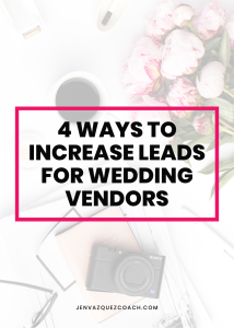
PINTEREST BEST PRACTICES
You should learn everything you can to make sure you are optimizing your time on Pinterest traffic possible.
PIN SIZE
Using a 2:3 ratio, pins are organized into columns, so Pinterest wants you to create vertical pins. If your pins aren’t this ratio, it’s probable that the Pinterest algorithm will show the pins less often than pins with the right ratio.
THE SECRET TO MAKE PINTEREST MARKETING EASY: Simplify and Streamline your process with the new Tailwind Create tool
PIN IMAGE
Pick an image that is related to your topic. Pinterest uses the image of your pin as data to show it to more people when it is most relevant. Pinterest actually looks at the photo on your pin and decides what your pin is about. So, if your image is of a wedding but you are a marketing coach – it will be confused. You want the image to match the title of or what your blog is about.
Whenever possible, try not to use free stock photos. If you use a free stock photo that has been used too many times and for different topics, you run the risk that your pin will be shown for the wrong topic.
The best thing you can do is to take your own images or pay for images as they will be used much less often. You can belong to a stock photo group like me or use the “pro” images on Canva. You can do this by paying for them or paying for the Pro version.
Using images of people You want to avoid using images of people as people go to Pinterest to be inspired and thus they want to picture themselves using the product or doing what the image is showing. You can use images of people’s hands, desks, laptops, phones, products, flat lays, and other lifestyle photos.
To get the most out of every blog post, you should utilize multiple pins. This gives you the best chance of getting more traffic and optimizing your blog post for Pinterest
Need Help with Pinterest
Want to optimize your Pinterest to drive traffic to your website? Take my free course to learn Pinterest the right way! ENROLL NOW!
TEXT OVERLAY
Make your text overlay count! Using keywords and less than 5 words is helpful. Use great headlines. Use fonts that are easy to read. If you are using a cursive type font, use it only for those words that are of, the, a, and, etc. Those aren’t important keywords. Pinterest reads the text, so if it’s cursive, it won’t be able to read it. Use a font size that could be read from mobile. Use hierarchy: play with different fonts, use bold or italics, use different colors.
PUT YOUR BLOG NAME/LOGO/WEBSITE ON YOUR PIN
Always make sure that your pins can be tied back to your website. Sometimes, a pin can lose it’s link because someone includes their website or by accident, so having a blog name, logo or website helps someone who finds it to be able to put your website on there.
Plus, it can be useful for branding recognition.

CREATE DIFFERENT TYPES OF PINS
When I first starting creating pins, I only used my brand colors. What I found is not everyone will click or be urged to click on the same pin. So, use different styles and colors to appeal to different people. Also, having pins with all the same design could get people confused and reduce your click-through and re-pinning rates.
Your content goes here. Edit or remove this text inline or in the module Content settings. You can also style every aspect of this content in the module Design settings and even apply custom CSS to this text in the module Advanced settings.

If you need help with Pinterest, shoot me an email HERE.

