Must-Have Elements for a Pinterest Pin: From Images to Call-to-Actions
Hey there, Pinterest enthusiasts! Ready to level up your Pinterest game? Pinterest isn’t just another social media platform—it’s a search marketing powerhouse, just like Google and YouTube. Your pins act both as your content and a visibility boost for your business. If you want your pins to stand out, drive traffic, and ultimately convert viewers into customers, nailing the design and content is essential. So, let’s dive into the must-have elements for a successful Pinterest pin!
1. High-Quality Images
The First Impression Matters
Bright, clear, and compelling. Your pin’s image is the first thing that users see, so it needs to be So it needs to make an instant impact. Use your high-resolution images that are bright and clear to draw attention.
Pro Tip:You can get photos in many ways:
- You can capture photos with your cell phone because it can make some beautiful images
- Secure a custom gallery from a professional photographer
- Use astock photo plan
- last on this list is free stock photos. (Everyone uses free stock photos and unfortunately, those tend to not do as well on Pinterest, probably because everyone has seen that picture somewhere else and it’s not unique on Pinterest).
Pinterest favors vertical images with a 2:3 aspect ratio, about 1000 by 1500 pixels. Tools like Canva can help you nail this size effortlessly. Why this size? Because it takes up more space in the feed or search results, making it more noticeable!
Relevance is Key
Ensure your image directly relates to the content you’re promoting. If you’re sharing a recipe, show a mouth-watering close-up of the finished dish. If you’re a wedding photographer, feature that beautiful wedding moment.
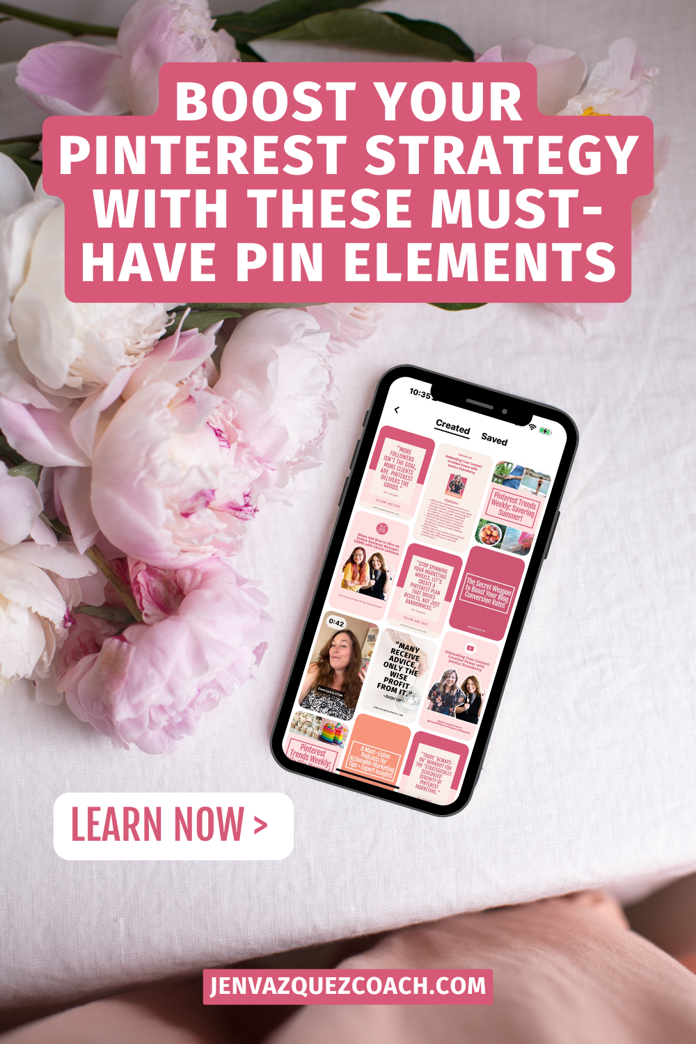
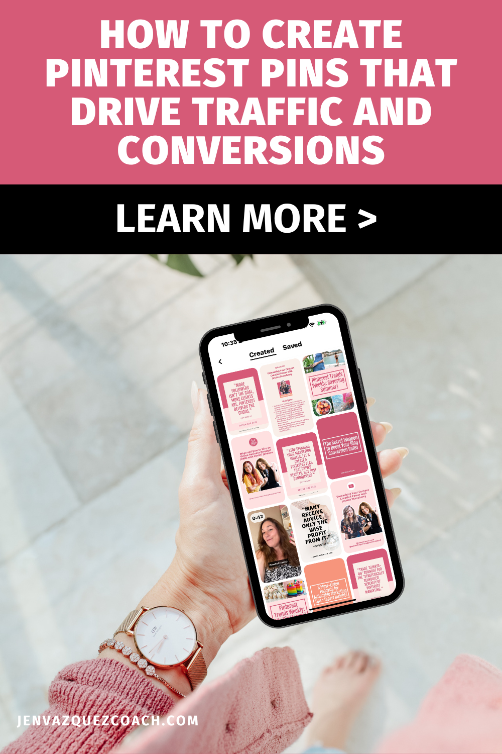
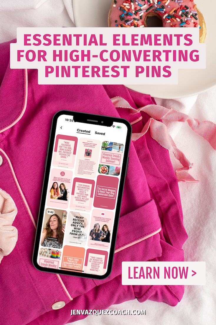
For blog posts, use images that reflect the blog’s theme. I love using visuals of laptops or cell phones displaying Pinterest, as it resonates well with users and the platform’s algorithms.
The Power of Negative Space
Don’t overcrowd your image. Negative space—the empty areas around the focal point—can be as impactful as the elements in your image. It makes text overlays stand out and enhances the overall design.
Want a Shortcut?
If you’re looking to elevate your Pinterest game and create eye-catching pins that stop the scroll, look no further than The Creative’s Desk Pin Templates. These templates are designed to save you time while maintaining a professional, cohesive look for your brand. Perfect for female service providers, coaches, photographers, or anyone using Pinterest to drive traffic, these templates provide a quick solution to designing pins that convert. Head over to The Creative’s Desk to explore their collection and start boosting your Pinterest strategy today!
2. Compelling Text Overlay
Readable and Eye-Catching
Text overlay is crucial for communicating what your Pin is about at a glance. Use bold, easy-to-read fonts for your main keywords and titles. Pinterest users tend to skim, so your text needs to grab their attention immediately. Cursive fonts can be beautiful but should be used sparingly and only for non-essential words that aren’t SEO keywords.
Keyword-Rich
Incorporate relevant SEO keywords in your text overlay. These keywords help your Pin show up in search results. Think about the terms your ideal client would search for and use them in your text.
Use AI
Use ChatGPT or Google Gemini (both have free options) and ask this: “Please create 5 SEO-optimized Pinterest pin titles and descriptions (400-500 characters with no hashtags and plain language using keywords people would search for on Pinterest) and deliver in a table format without quotes.”
Contrast Matters
Ensure there’s a strong contrast between your text and the background image. This makes your text stand out and easier to read. If needed, use a solid color background or a semi-transparent overlay behind your text to increase visibility.
3. Strong Call to Action (CTA)
Always Include a CTA
Every Pin should have a clear and compelling call to action. Whether it’s “Learn More,” “Shop Now,” “Download,” or “Get the Recipe,” your CTA should guide users on what to do next. This increases engagement and directs traffic to your desired destination.
Placement and Visibility
Place your CTA in a prominent position where it’s easily visible without overwhelming the design. The bottom or top center of your Pin is often a good spot.
Incentivize Action
Give users a reason to click. Whether it’s accessing a special offer, downloading a free resource, or discovering an exclusive tip, make sure your CTA communicates the benefit of taking action.
FREE Download
Download my free 80 CTA tool. to help you to not have to be creative. You merely need to find one for your pin from the 80 shared.
4. Branded Elements
Include Your Website URL
Your website URL should be visible but not intrusive. Placing it at the bottom or in a corner of the Pin reinforces brand recognition and helps protect your content from being shared without credit.
Consistent Branding
Consistency is key to building brand recognition. Use the same colors, fonts, and design elements across all your Pins. This cohesive style makes your Pins instantly recognizable in users’ feeds, even before they notice your URL.
Watermark or Logo
Consider adding a small logo or watermark to further protect your content. This should be subtle so it doesn’t distract from the main message but still serves to reinforce your brand identity.
Pinterest Membership
Pinterest Strategy Club
A community membership that helps you to learn Pinterest live. There’s a mini course to optimize your Pinterest to have it help you grow your business. There are two live calls a month, a Pinning Session for accountability and a Q+A session. Also, Pin templates each month to download.
5. Engaging Pin Title
Keyword Optimized
Your Pin title should include relevant keywords that potential clients are likely searching for. The title should clearly communicate the value or benefit users will gain by clicking. For example, “5 Easy Steps to Create Pinterest-Worthy Images” is more compelling than just “Pinterest Image Tips.”
Action-Oriented
Use action verbs to make your title more engaging. Words like “Discover,” “Learn,” “Try,” or “Boost” encourage users to take action.
Pinterest truncates long titles, so keep it concise—aim for around 40-60 characters. Ensure the most important information comes first.
6. Detailed Pin Description
SEO-Friendly
Pinterest uses your Pin description, title, text overlay, and image name to understand the content of your Pin and surface it in relevant searches. Use this space to naturally incorporate keywords that your target audience is searching for. Avoid keyword stuffing, as it can make your description sound spammy.
Clear Call-to-Action
End your description with a strong CTA to guide users on what to do next. Phrases like “Click to learn more,” “Save this for later,” or “Get the full tutorial now” encourage engagement and drive traffic.
Provide Value
Your description should clearly convey what the user will gain by clicking on your Pin. Whether it’s a step-by-step guide, a valuable tip, or an exclusive offer, make sure the value proposition is front and center.
7. Clickable Link
Direct to Valuable Content
The link you attach to your Pin should lead directly to the content you’re promoting, whether it’s a blog post, product page, or lead magnet. Avoid linking to your homepage unless it’s directly relevant to the Pin.
Use Trackable URLs
To measure the effectiveness of your Pins, use UTM codes or other tracking parameters. This allows you to monitor how much traffic and conversions each Pin generates, helping you refine your strategy over time.
Avoid Dead Links
Regularly check your Pins to ensure that all links are still active and lead to the correct destination. Broken or outdated links can frustrate users and harm your credibility.
By incorporating these elements into every Pin, you’ll create a powerful, cohesive Pinterest strategy that not only attracts attention but also drives meaningful engagement and traffic to your website.
Here is more information that may be helpful!
7 Highlights from Canva Create 2022
7 Highlights from Canva Create 2022 *There is an affiliate link included in this blog. You won’t pay more and may get a discount or free trial and I will get a stipend if you choose to purchase. On September 14, 2022, Canva revealed some of the exciting ways they are...
Pinterest Predicts Weekly 9-16-22
Pinterest Predicts Weekly 9-16-22 I’ll be sharing these weekly tips so you know what’s trending for you to focus on when creating content for Pinterest. *This information is directly from the Pinterest Business Community. I'm sharing (after reading the Pinterest...
Pinterest Predicts Weekly 9/9/22
I’ll be sharing these weekly tips so you know what’s trending for you to focus on when creating content for Pinterest. *This information is directly from the Pinterest Business Community. Refreshed spaces: It’s a transitional time for people on Pinterest. Some are...
Don’t Forget to Pin It!
