Have you ever felt like you were living a life that wasn’t truly yours? Weighted down by expectations, fears, and societal norms? Imagine if you could uncover your unique energetic blueprint and break free from those limitations to live a life of abundance and...
Pinterest Trends Weekly: Let’s Get Together!
Pinterest Trends Weekly: Let’s Get Together!
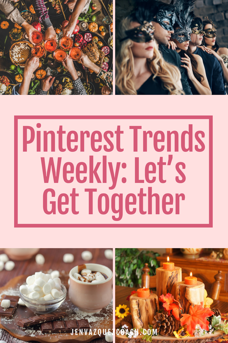
What are people searching for on Pinterest? Pinterest collected insights this week around the theme: Let’s Get Together!
This week on Pinterest, people are searching for food and drink ideas, decoration inspiration, and group games to play at their next soirée.
Key trends
- 130% increase in “friendsgiving invitations”
- 185% increase in “western party centerpieces”
- 3x increase in “taco cupcakes”
- 25% increase in “gift basket ideas for men”
- 75% increase in “friendsgiving aesthetic” among Gen Z
- 30% increase in “easy party food for a crowd” among Millennials
- 70% increase in “home coffee bar”
Discover Tomorrow’s Trends with Pinterest
Pinterest is all about looking ahead. With over 522 million people using the platform to uncover future ideas, it should be your go-to source for inspiration and for what’s trending for creating content. By keeping an eye on current trends, Pinterest can provide you with valuable insights into what’s likely to catch on elsewhere soon.
Every week, Pinterest Predicts Weekly showcases actionable search trends, tailored to users across various categories, regions, and demographics. Dive into the details on trends.pinterest.com, where you can explore insights and do content planning around the hottest search queries.
Creative Marketing Summit
Alright, friends! If you’re a service provider or small business owner who’s been searching for a fresh way to boost your marketing game, listen up! This episode is brought to you by the 3rd Annual Creative Marketing Summit. 🎉
This summit isn’t just another fluff-filled event – it’s where real marketing strategies meet creativity, designed to inspire action and save you time. Think marketing experts delivering education packed with actionable tips, powerful insights, and, of course, the chance to network with other service providers just like you.
I’m super passionate about making marketing education accessible, which is why we’re offering a FREE ticket giveaway! Because everyone deserves the chance to find, attract, and book their ideal clients without overwhelm.
Whether you’re a wedding pro, photographer, coach, or entrepreneur – this summit has something for YOU. Don’t miss your chance to learn how to simplify your strategy, grow your leads, and have a little fun along the way.
Head over to creativemarketingsummit.com to grab your ticket!
Alright, let’s dive into today’s episode!
Event Planning & Hosting
- +130% increase in Friendsgiving invitations
- +185% increase in Western party centerpieces
- +40% increase in large group games
- +25% increase in outdoor entertaining areas
- +50% increase in cookie decorating parties
Food Trends
- 3x increase in searches for taco cupcakes (Yes, taco cupcakes!)
- +80% increase in garlic butter chicken bites
- +60% increase in mini cakes for birthdays
- +50% increase in cornbread dressing
Gifting Trends
- 5x increase in creative gift baskets
- +45% increase in gifts for teens
- +25% increase in gift basket ideas for men
- +25% increase in laser-engraved gifts
Audience Trends: Curious Celebrations
Gen Z Trends
- +80% increase in Friendsgiving dinner parties
- +75% increase in Friendsgiving aesthetic
- +55% increase in hot chocolate bars
- +30% increase in snack boards
Millennials Trends
- +115% increase in Friendsgiving tablescapes
- +40% increase in masquerade parties
- +30% increase in easy party food for a crowd
- +25% increase in favorite things parties
Pinterest Predicts: Cafe Core is On the Rise
Create coffee-shop vibes at home with Pinterest’s emerging “Cafe Core” trend. Users are leaning into vintage and handmade décor for cozy home coffee stations. Here’s what’s trending:
- +140% increase in handmade mugs
- +85% increase in vintage cafe décor
- +70% increase in home coffee bars
- +50% increase in mini coffee bars for small spaces
- +35% increase in coffee shop interior design
Don’t Forget to Pin It!
Here is more information that may be helpful!
251 | Discovering Your True Potential: How Human Design & Gene Keys Can Transform Your Life with Diamond Drip
7 | How to Repurpose Content for Maximum Business Success
Repurposing content is a game-changing strategy for online business success. In the latest Marketing Duo Podcast, Jen Vazquez and Cinthia Pacheco dive deep into how to make your content work smarter, not harder. If you're looking for ways to save time, amplify your...
6 | Fun Digital Marketing News December 2024: Marketing News Roundup: AI Growth, Pinterest Updates, and a Free Summit You Can’t Miss
Fun Digital Marketing News December 2024: Marketing News Roundup: AI Growth, Pinterest Updates, and a Free Summit You Can’t Miss This week on the blog, we’re diving into some exciting marketing news – including jaw-dropping AI developments, Pinterest’s latest tools,...
